Big Road
Pili Hu, VSCode and GitHub

This is a simplist solution to a mobile-only web story. Users with no coding background should be able to use this template after a 10 minute crash course on HTML. One does not need to learn CSS, in order to make it work in a reasonable way.
"Big Road" has the following key features:
p, em, strong
iframeMake your first web story in three steps:
index.html to include your contentusername.github.io/big-road/. For example this current page is available at hupili.github.io/big-road/. Checkout
this page for more information about hosting on GitHub Pages.
You have already seen headings (h1, h2, h3), listings (ul, ol, li), and paragraph (p) in previous codes. In this section, we show you several other useful
elements.
In a pragraph, there may be some key information that you want to highlight. In HTML, we have two basic semantic tags for this purpose. You can emphasize something , or strongly emphasize something. The difference here is subtle and the choice depends on the author.


Note, an image aspect ratio of 16:9 is recommended as a sensible default.
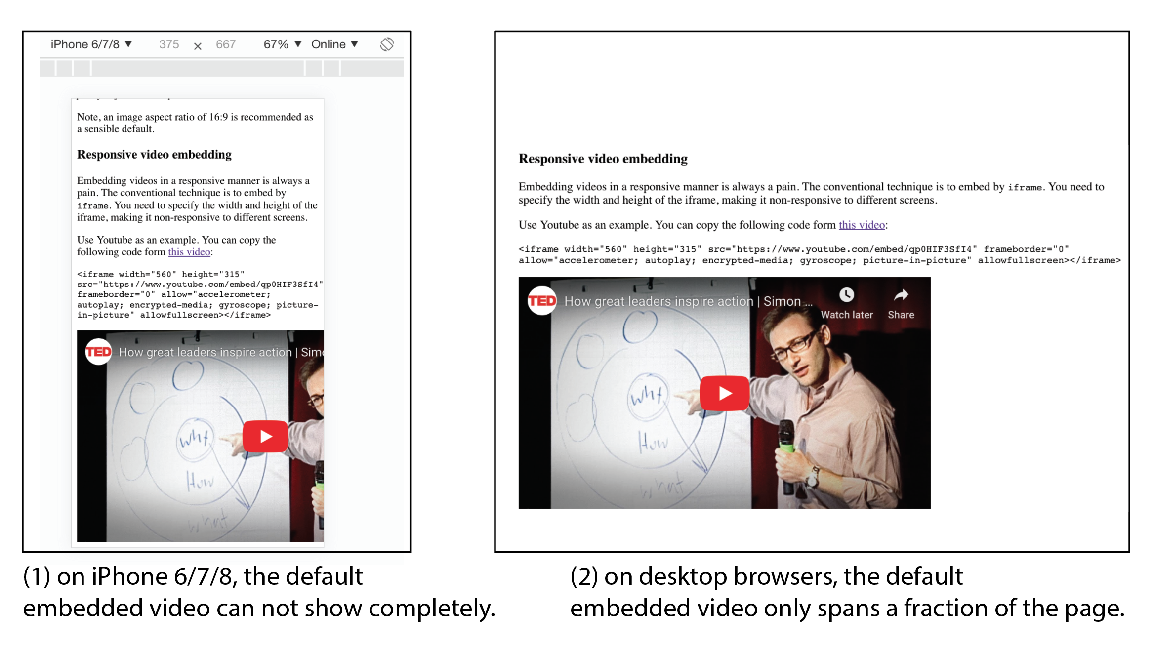
Embedding videos in a responsive manner is always a pain. The conventional technique is to embed by iframe. You need to specify the width and height of the iframe, making it non-responsive to different screens.
Use Youtube as an example. You can copy the following code of this video from its "Share --> Embed" button:
<iframe width="560" height="315" src="https://www.youtube.com/embed/qp0HIF3SfI4" frameborder="0" allow="accelerometer; autoplay; encrypted-media; gyroscope; picture-in-picture" allowfullscreen></iframe>
The default result is as follows:

Following is one responsive video. You can check the source code of this page to see how it works. You don't have to completely understand the internal works. Simply subsituting the URL suffices.
With the wide spread tools today, you don't have to learn frontend technology in order to make interactive charts. For example, there are off-the-shelf online tools like infogram.com, datawrapper, and flourish.
If you are Python developer, libraries like plotly, pyecharts, bokeh, and folium can help you generate interactive charts and maps within Python environment. Next question is how to embed those
interactive charts into your final work.
The first thing is to use your chosen library/ online tool to export a standalone webpage that includes your chart. The webpage may come along with other auxiliary files like Javascript and CSS. You need to put those files all in one folder. Then use your browser to visit the webpage and make sure the chart looks normal as a standalone project. After that, ou can apply the same technique used from above responsive Youtube video to embed it into your web story Just use the following code block and replace the "src" attribute with the right path to your stand alone interactive chart.
<responsive-block><iframe src='//server-name/path/to/the/file.html' frameborder='0' allowfullscreen></iframe></responsive-block>
Here is an example of a map made from Python's folium library. It is the original hi-fi version of the raster image used in this blog post. Although the following one is
not interactive or animated, you can easily make it so from the folium library.
Following is an animated and interactive map of Sichuan's earthquake in past 100 years. It is made by D3. The project includes many auxiliary files to make the chart work. We'd like to show you that the responsive block works with not only charts on your local disk, but also charts (more precisely HTML pages) from the Internet. Note, in the "src" attribute, please start your URL with "//", not "http", or "https". This notation lets the browser determine which protocol to use and improves compatibility.
Note that the default aspect ratio is 16:9. Sometimes, 1:1 may look better on a vertical screen. Or, you can try 4:3, whose code is available in HTML comment block. Other aspect ratios are not suggested since this is a starter's template.
It does not use up the entire space on a desktop computer. However it is still readable. Now that 80% traffic is on mobile web, this should suffice for most web stories. Also note that, you just learned HTML 10 minutes ago and this is what you can make.
Have fun.
Find the GitHub repo here.