Section 3 ---- test
Make data beautiful
Recap
Yes, I've got the data and make it clean. What's next?
Data story:
text
chart
graphic
news app
....
What is the best way to present data?
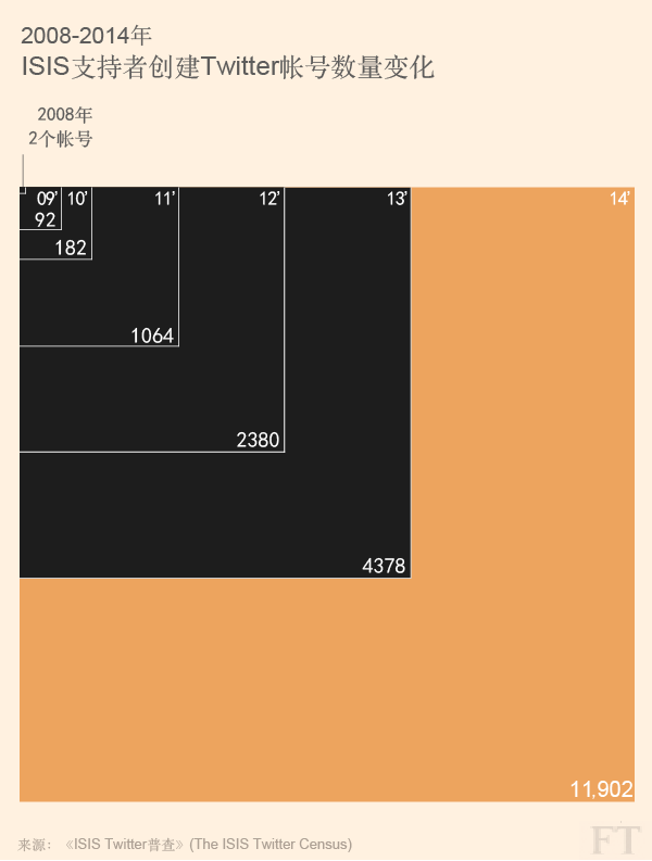
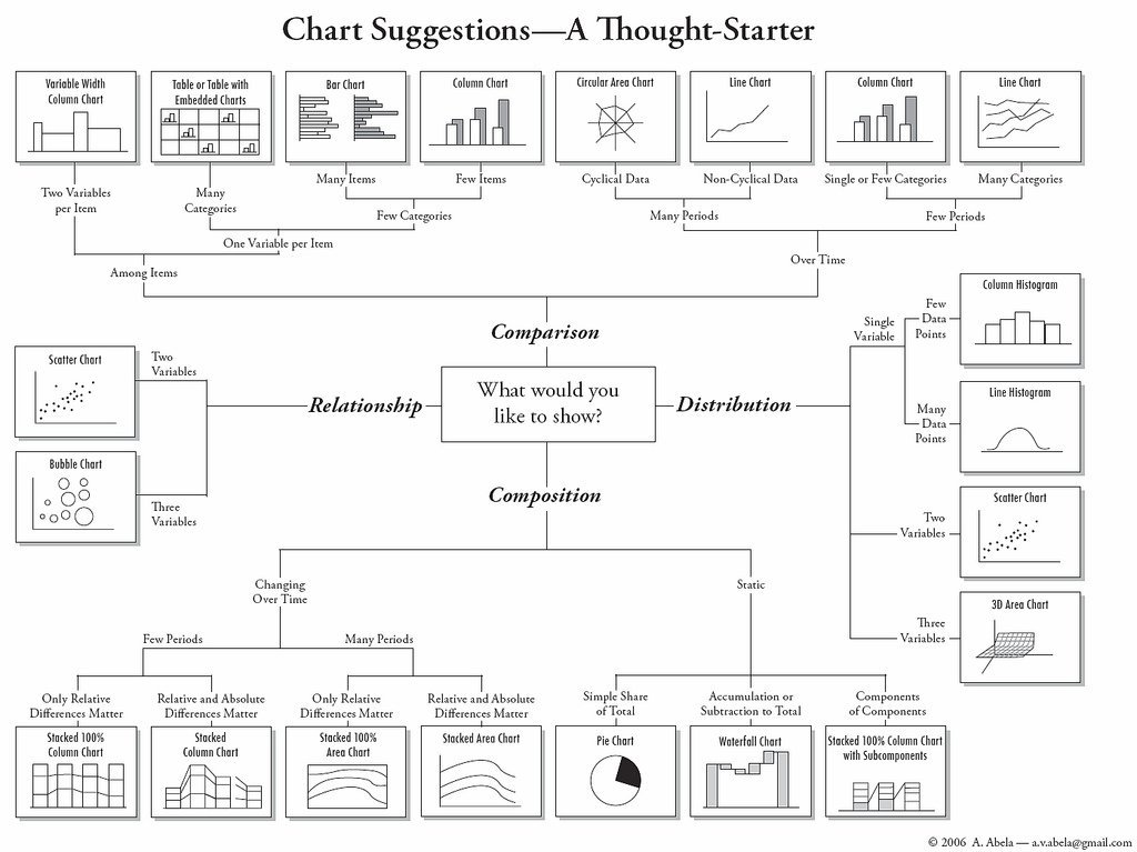
Basic Charts
reference
Line
Track changes over time.
Bar
Compare categories
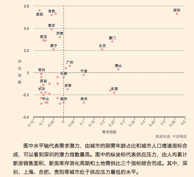
Bubble
compare
Bubble
Common Tools
Adobe illustrator
Excel/google spreadsheet
free tools online (google it)
d3.js
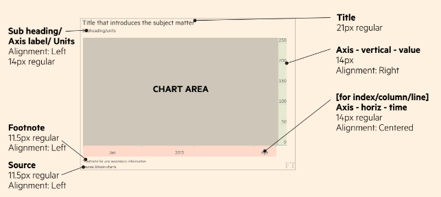
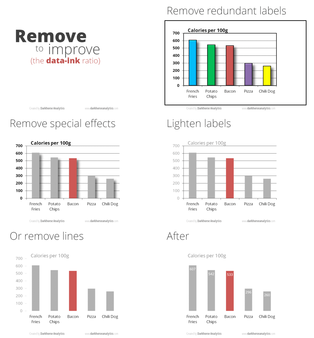
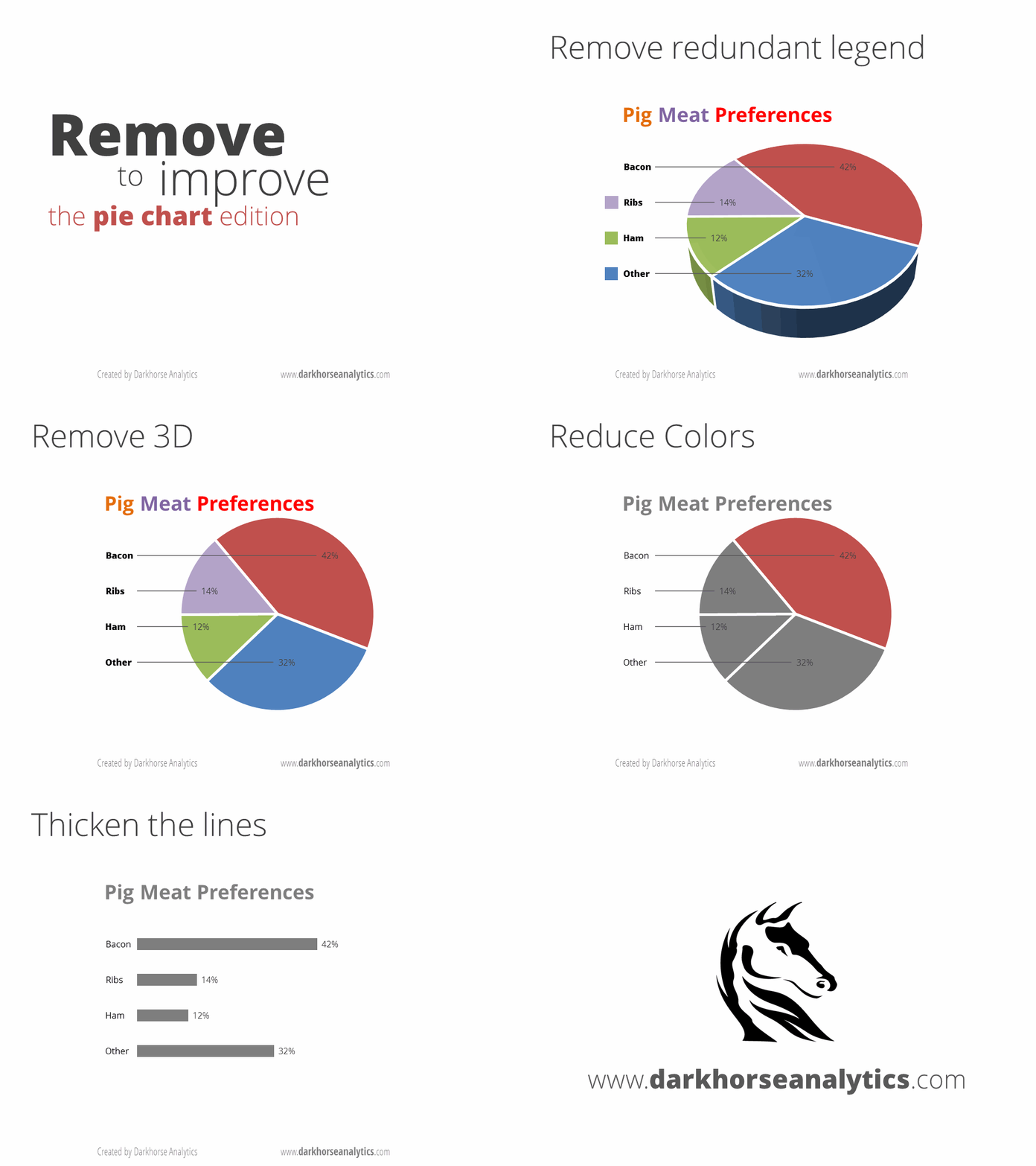
Basic design rules
reference
The goal should be
clarity
rather than
simplicity.
Excercise
google spreadsheet
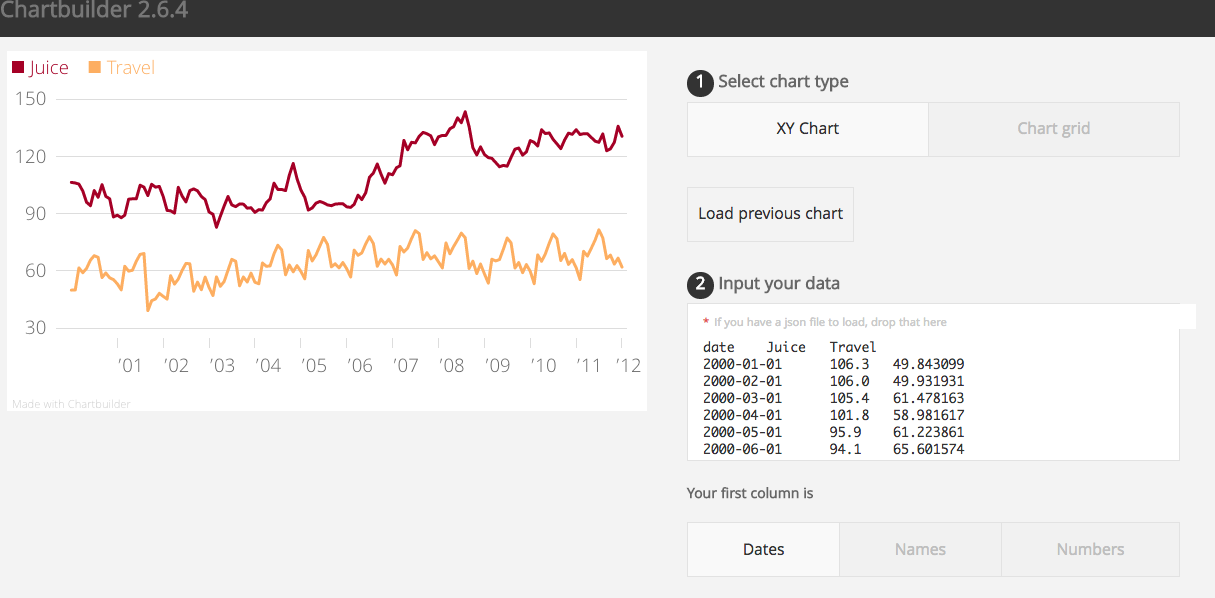
Quartz's chartbuilder
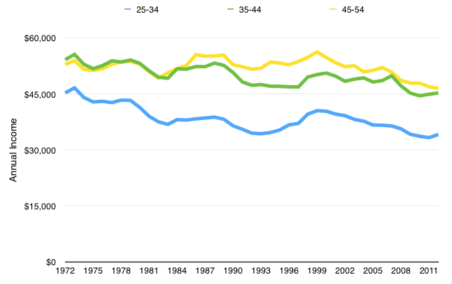
How to cheat with charts?
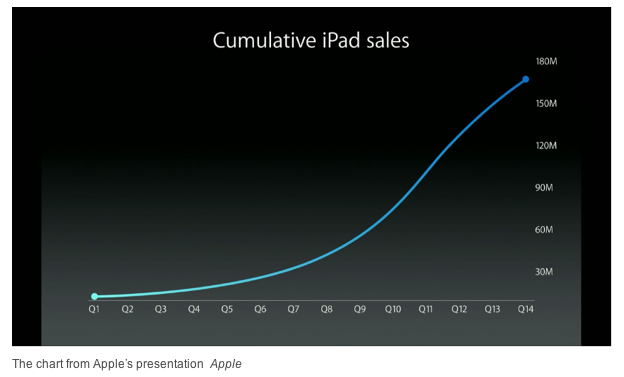
Apple is either terrible at designing charts or thinks you won’t notice the difference (Quartz, 2013)
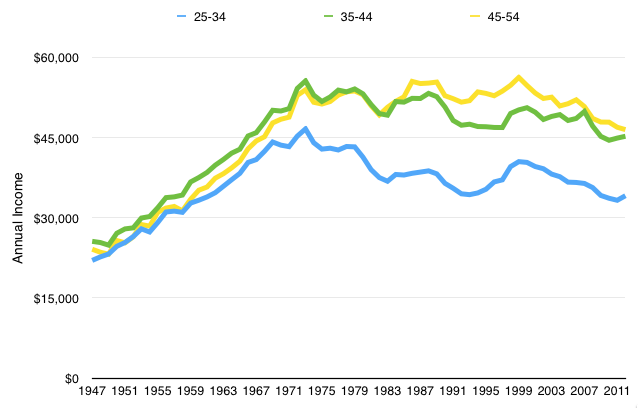
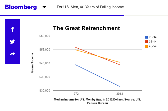
For U.S. Men, 40 Years of Falling Income
How journalists make arguments with distorted data
How journalists make arguments with distorted data
One Report, Diverging Perspectives (NYT, 2012)
hiding something?
Section 4
Going further
Global Trends
Trend 1
Skills level up
Japan: the next big quake(FT, 2016)
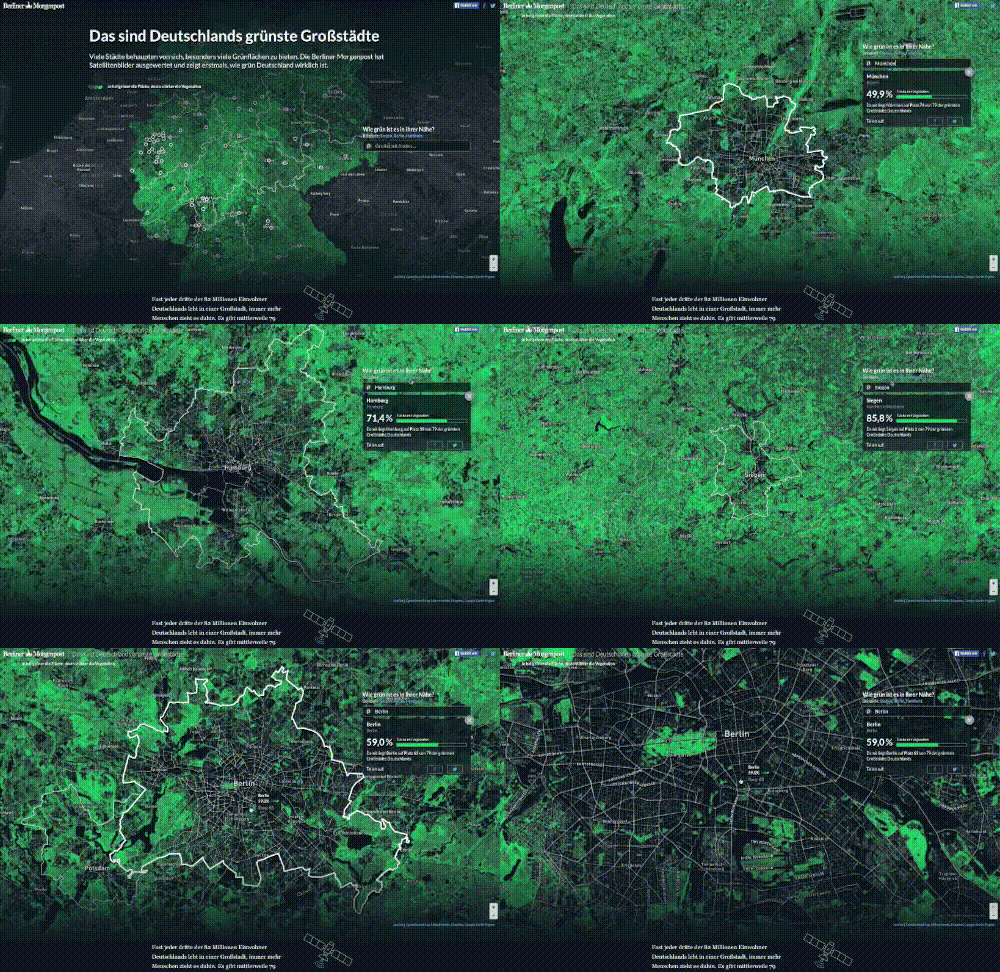
How green Germany really is (Berliner Morgenpost, 2016)
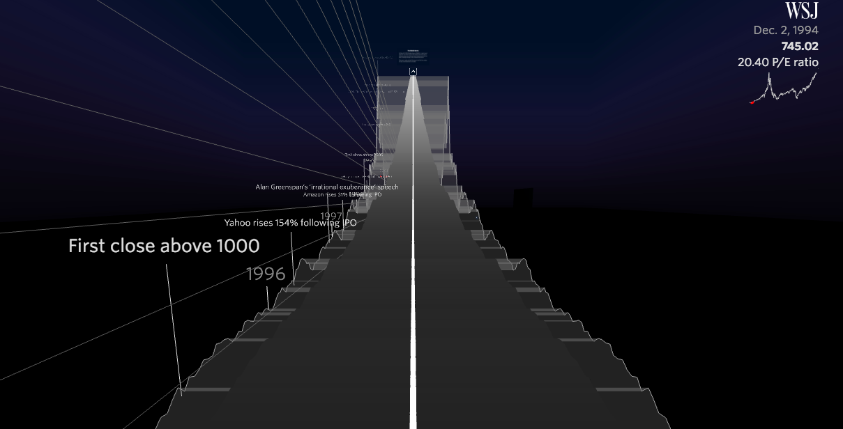
Is the Nasdaq in Another Bubble?(WSJ, 2015)
Trend 2
Mobile centric
Scroll
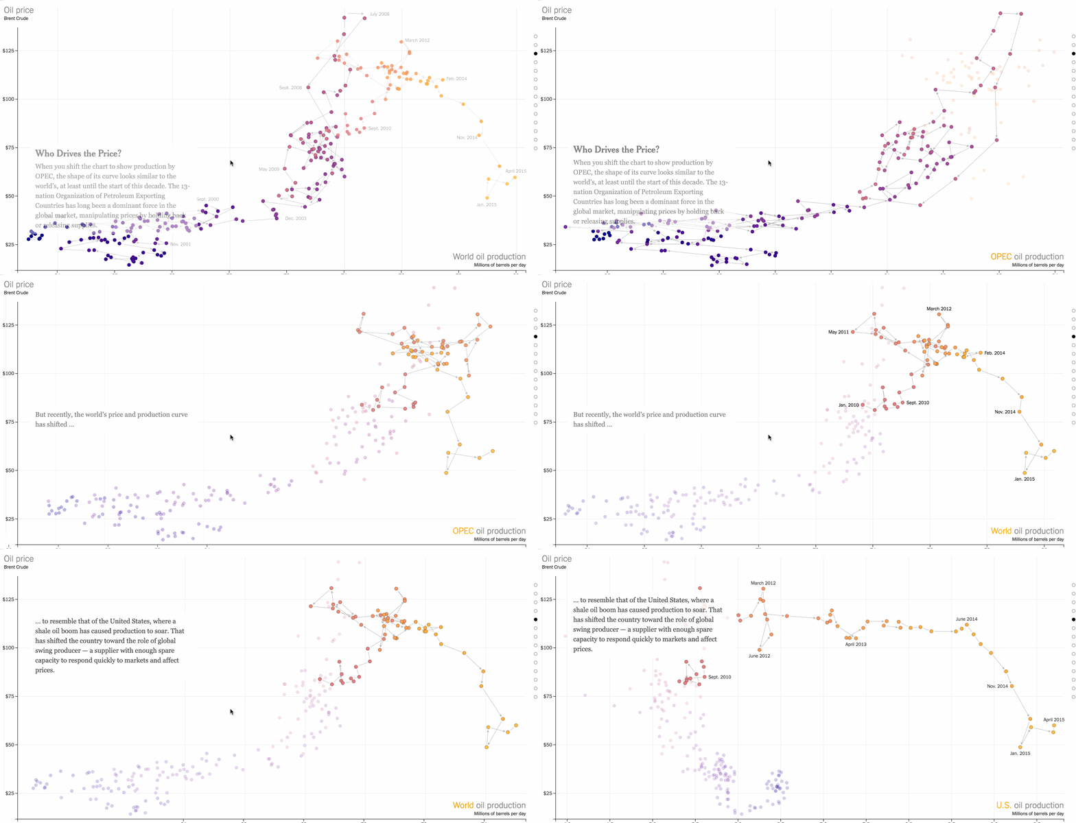
How the U.S. and OPEC Drive Oil Prices(NYT, 2015)
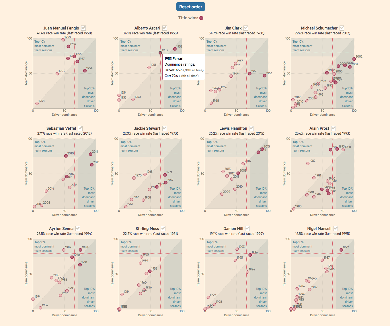
Who are the best ever Formula One drivers?(FT, 2015)
Static (gif)
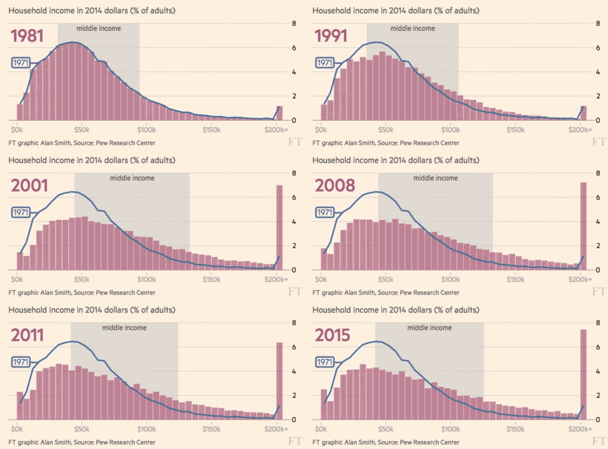
America’s Middle-class Meltdown: Core shrinks to half of US homes(FT, 2016)
"Static images are the most effective form of communication."
Archie Tse, NYT
“If it doesn’t work on mobile, it doesn’t work."
Trend 3
Coversation with readers
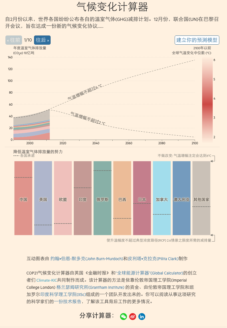
气候变化计算器(FT中文, 2015)
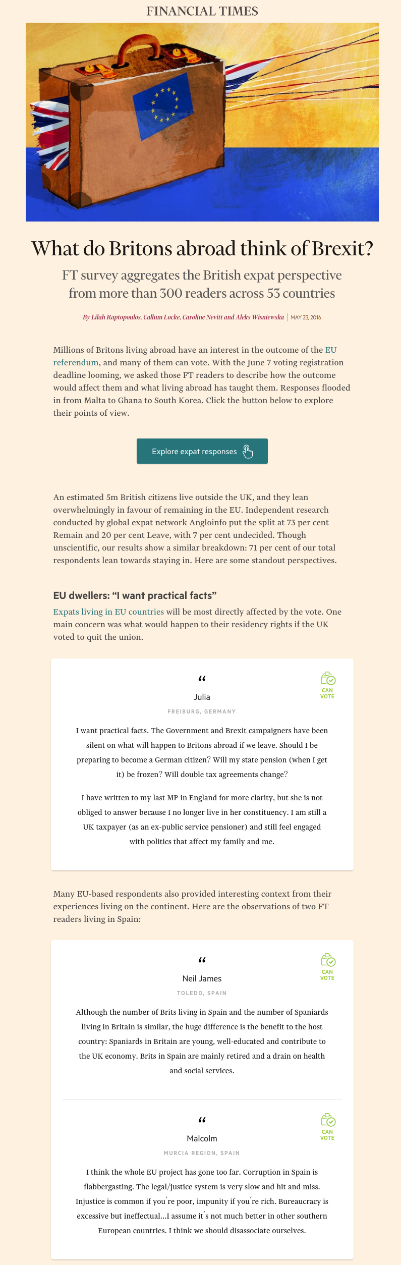
What do Britons abroad think of Brexit? (FT, 2016)
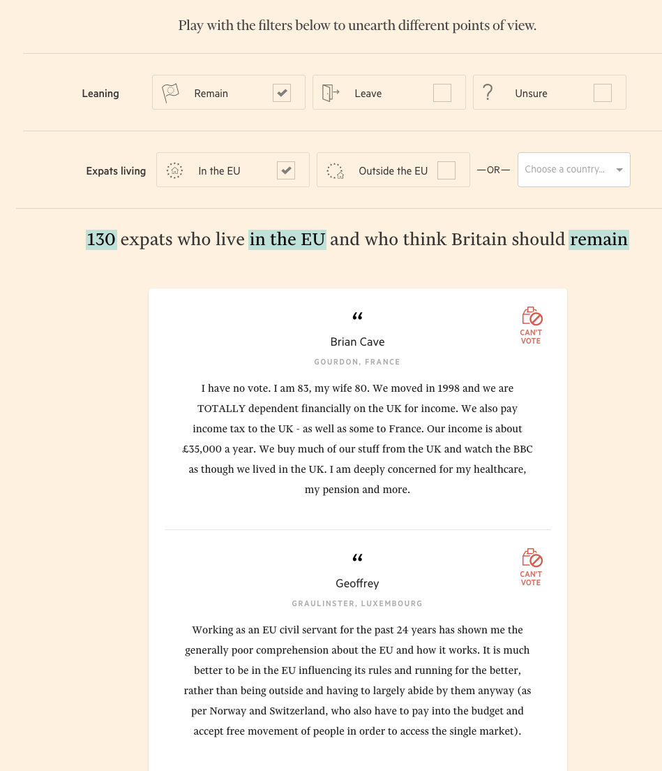
What do Britons abroad think of Brexit? (FT, 2016)
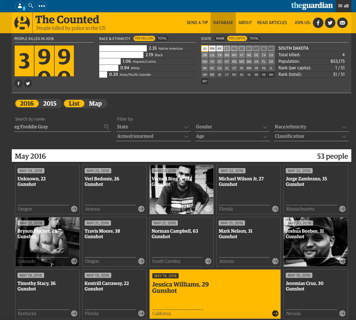
The Counted: People killed by police in the US(Guardian US, 2015)
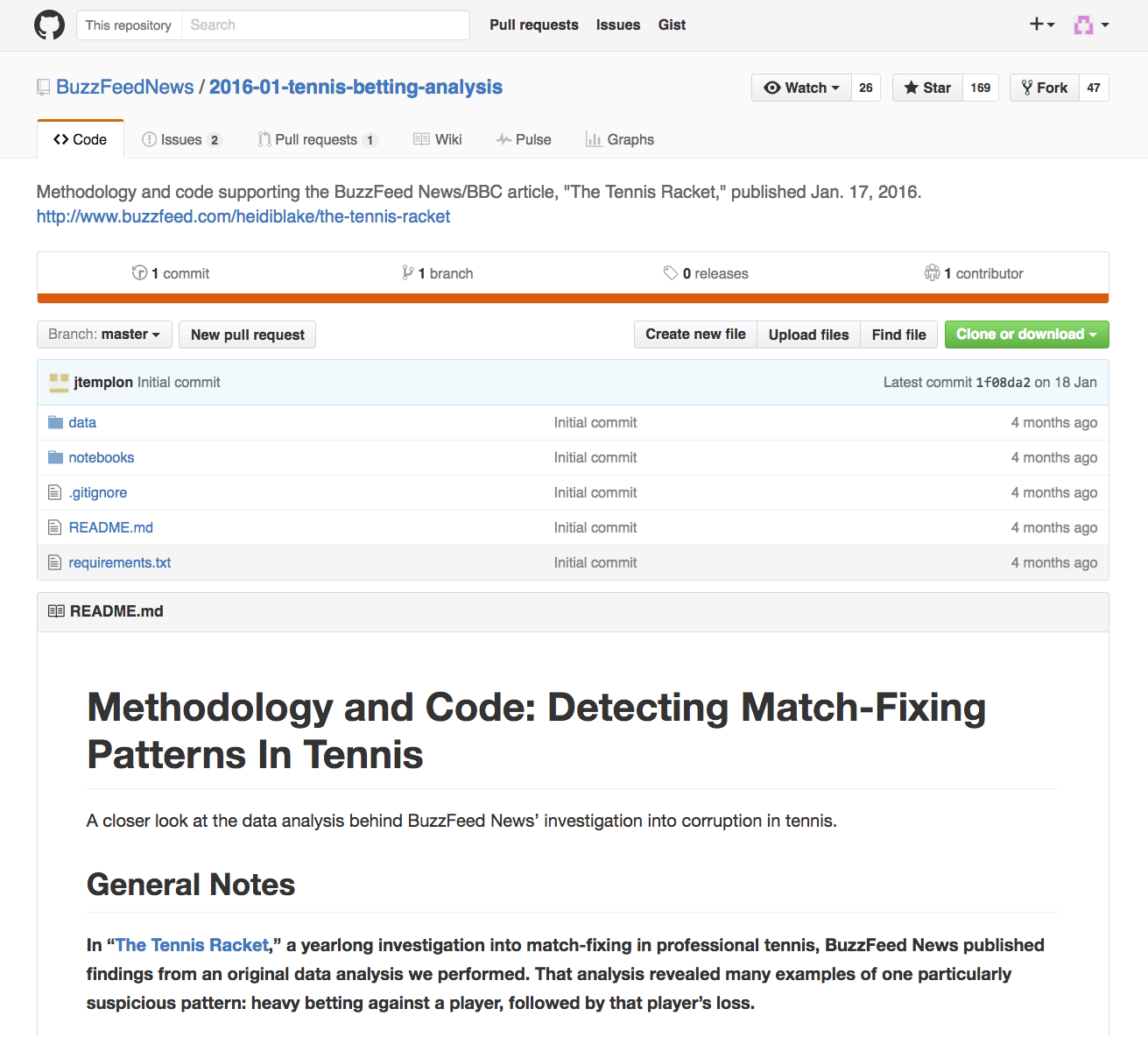
Methodology and code(Buzzfeed, 2016)
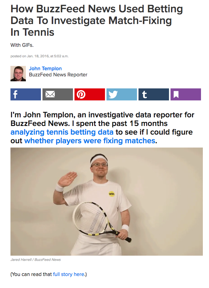
How BuzzFeed News Used Betting Data To Investigate Match-Fixing In Tennis(Buzzfeed, 2016)
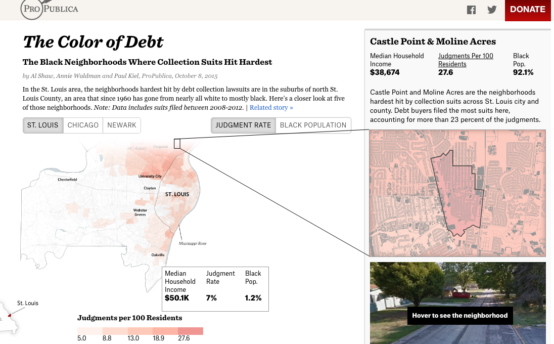
The Color of Debt(Propublica, 2015)
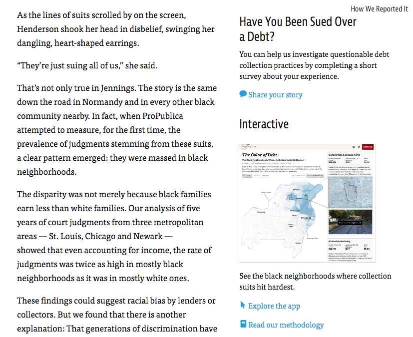
The Color of Debt(Propublica, 2015)
Trend 4
Collaboration
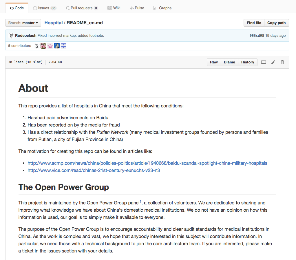
Journalism + civic hack
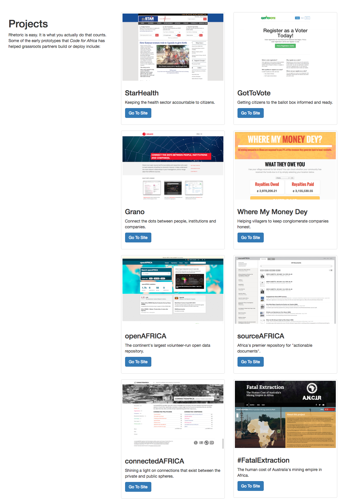
Code for Africa
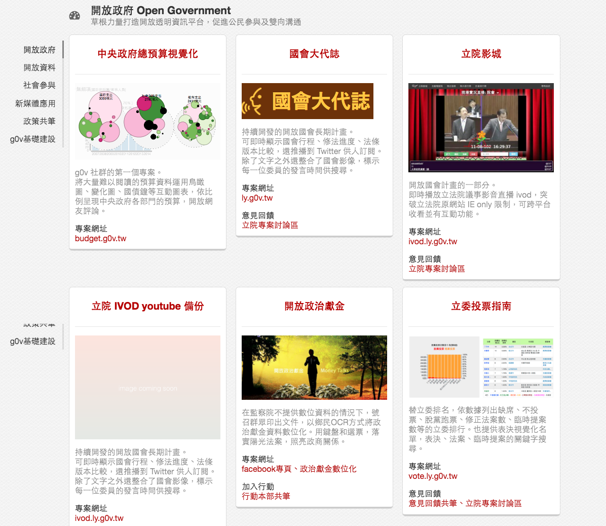
Taiwan's g0v
Taiwan's g0v
Question remained
Going further
how to train yourself?
I'm not born with these skills.
Majored in public administration in college.
Trained magazine writing for almost 5 yrs.
Expolore the possibility of the future of journalism in graduate school. Taught myself ever since.
Unlimited resources on the internet
People.
Connect the dots.
People → knowing who to follow.
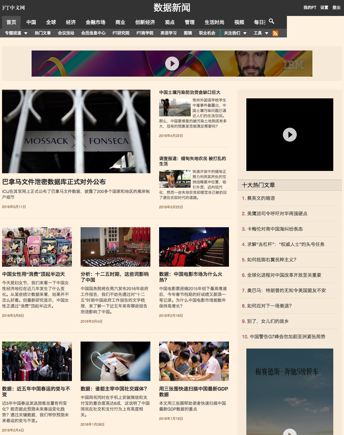
FTChinese.com
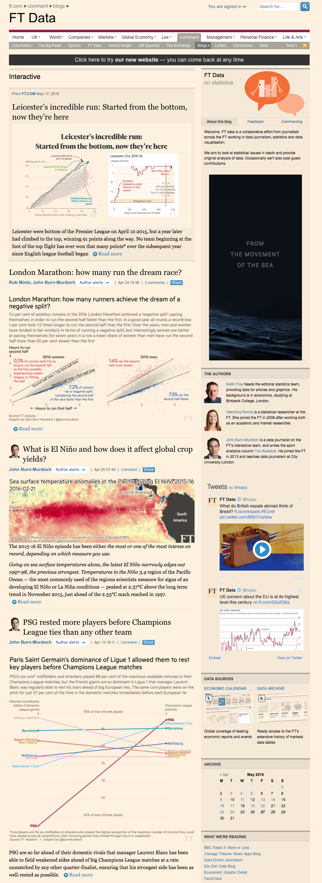
FT Data blog/interactive
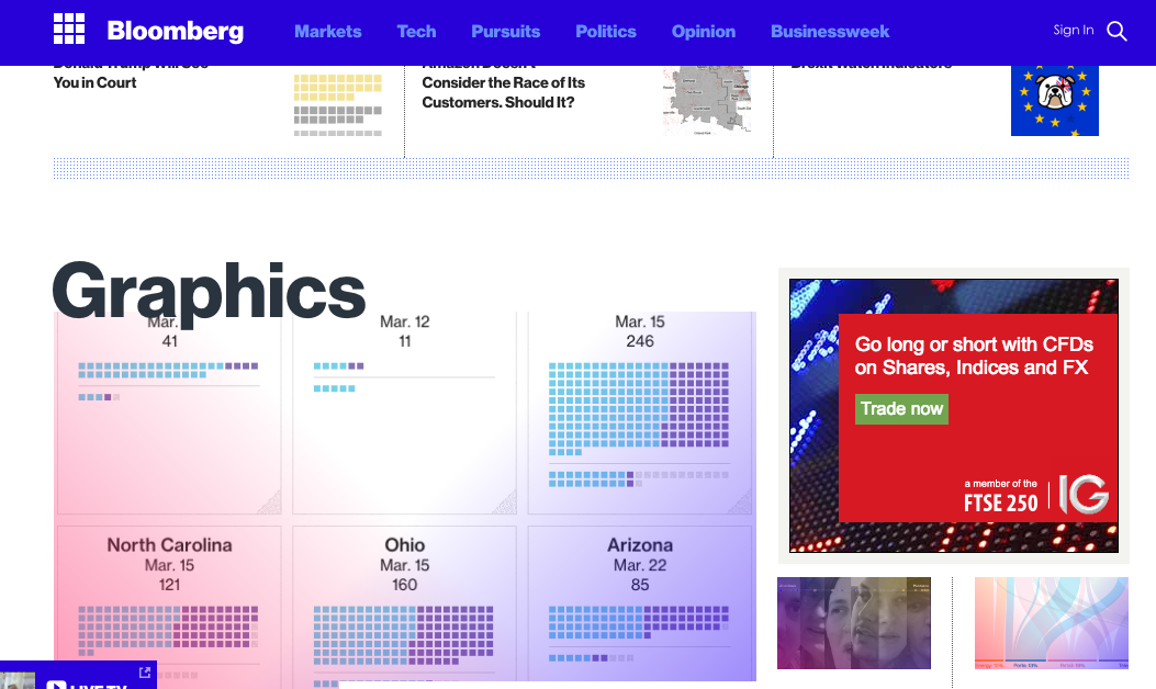
bloomberg graphics
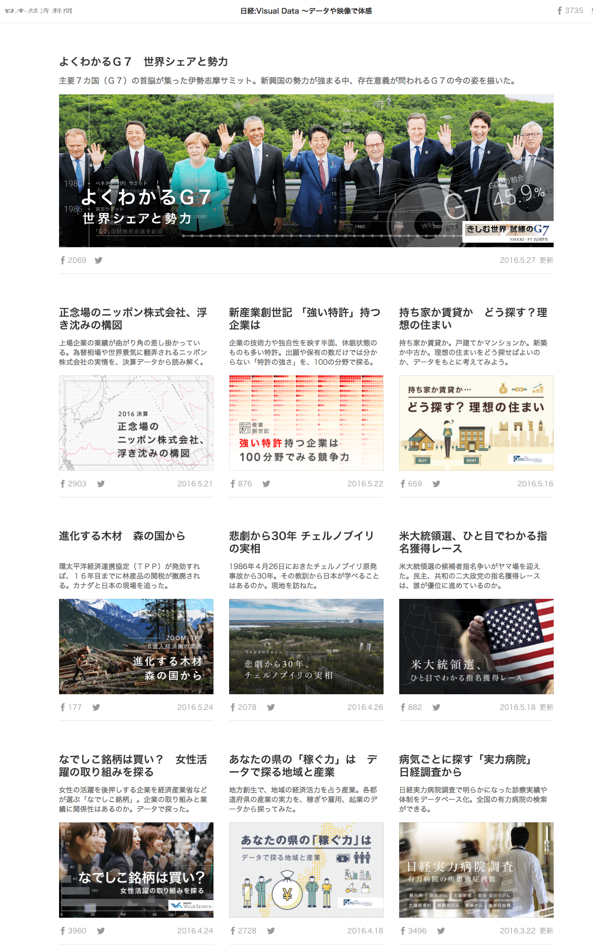
nikkei's visual data
#ddj #dataviz
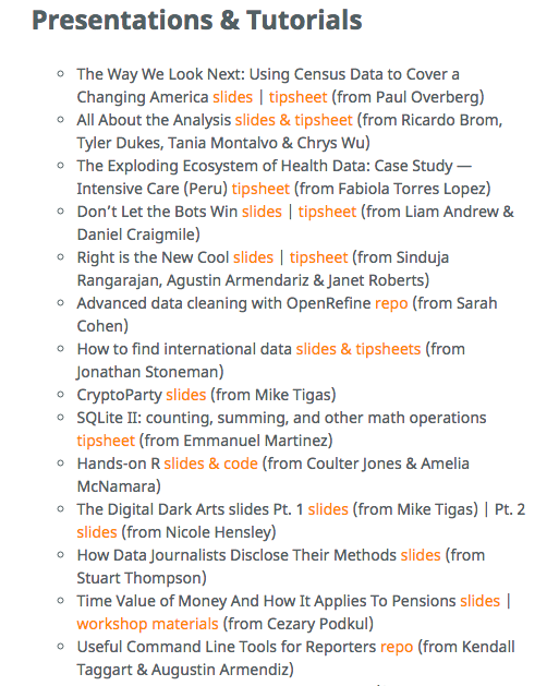
NICAR 2016 Slides, Links & Tutorials #NICAR16
Connect the dots → Cross the border.
Design + Coding + Journalism + Thinking wild
Thanks!
@silvashih
silva.shih@ft.com
www.ftchinese.com/channel/datanews.html